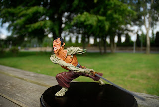
The colour scheme for the ronin was pretty straight foreward. I once again took my inspiration from Frank Miller's Ronin and decided to stick to what was represented in the graphic novel. I added my own twists here and there.
the robot parts had too look as dead as the skin looked alive. therefore I chose an oveall green palette for the limbs as an opposition to the red palette of the skin and clothes. The pattern on the sash draws atttention to the sculpture as a whole. It is a focus point for the eye.
here are some more lovely outdoor shots.
Photos by: Martin Bested


Ingen kommentarer:
Send en kommentar